

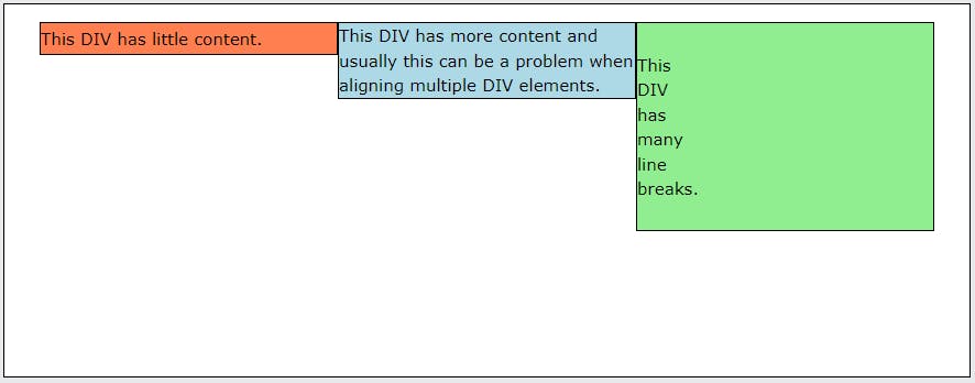
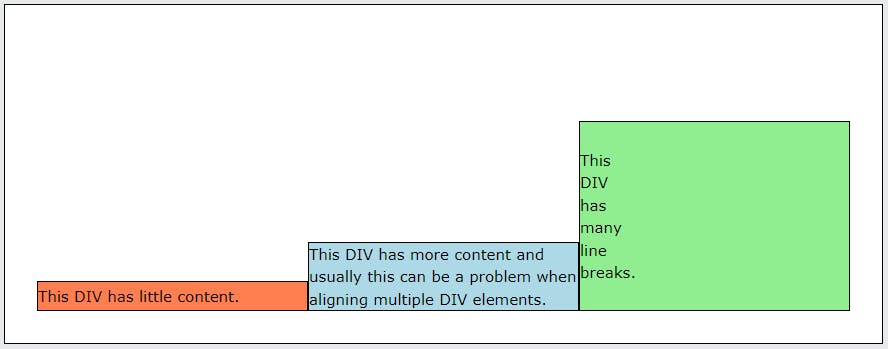
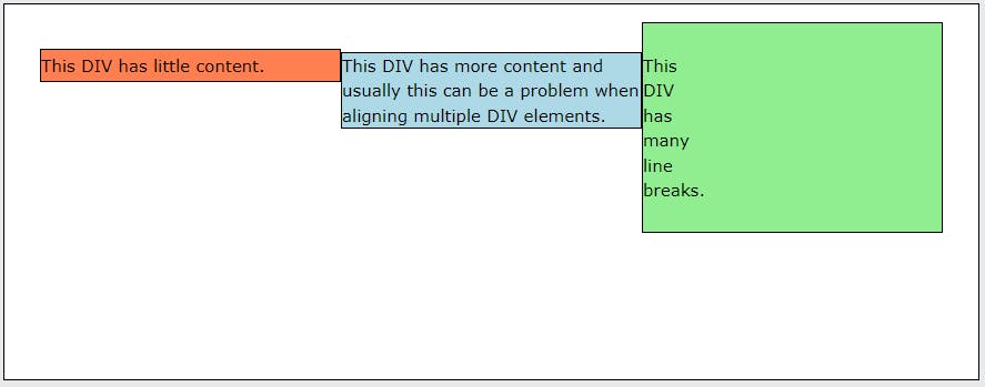
Flexbox
- A CSS3 layout mode that provides an easy and clean way to arrange items within a container
- Responsive and mobile friendly
- Order of elements can easily be changed without editing the source HTML
Flex Container Properties
display
- This defines a flex container; inline or block depending on the given value
- The flex container becomes flexible by setting the display property to flex
- in inline-flex, the element behaves like an inline element and lays out its content according to the flexbox model
display: flex;
display: inline-flex;
flex-direction
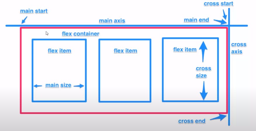
- The flex-direction property defines in which direction the container wants to stack the flex items.
flex-direction: column;
flex-direction: column-reverse;
flex-direction: row;
flex-direction: row-reverse;
flex-wrap
- The flex-wrap property specifies whether the flex items should wrap or not.
flex-wrap: wrap;
flex-wrap: nowrap;
flex-wrap: wrap-reverse;
justify-content
- The justify-content property is used to align the flex items. (hover above them to see the property)
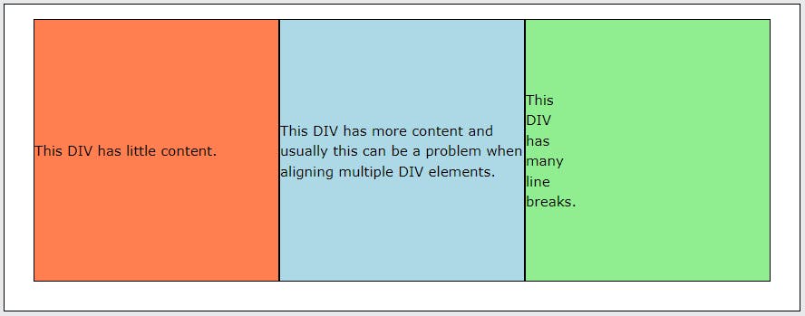
align-items
align-items: stretch;stretch to fill the container
align-items: center;items are centered in the cross-axis
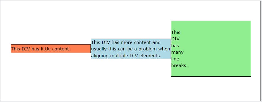
align-items: flex-start;items are placed at the start of the cross axis.
align-items: flex-end;items are placed at the end of the cross axis.
align-items: baseline;- items are aligned such as their baselines align
align-content
align-content: flex-start;items packed to the start of the container.
align-content: flex-end;items packed to the end of the container.
align-content: center;items centered in the container
align-content: space-between;items evenly distributed; the first line is at the start of the container while the last one is at the end
align-content: space-around;items evenly distributed with equal space around each line
align-content: stretch;lines stretch to take up the remaining space
align-content: space-evenly;- items are evenly distributed with equal space around them
Flexbox Children
- order: Controls the order in which flex items appear in the flex container.
order: 1;
- flex-grow: Allows you to define the ability for a flex item to grow.
flex-grow: 1;
- flex-basis: This defines the default size of an element before the remaining space is distributed.
flex-basis: 50%;
- flex-shrink: This defines the ability for a flex item to shrink.
flex-shrink: 1;
- align-self: Sets the alignment for individual items.
align-self: flex-start|flex-end|center|baseline|stretch;
Bonus
- Here is a cool little game where you can learn flexbox
- flexboxfroggy.com
Reference
Thank you for reading