

What is CSS Grid
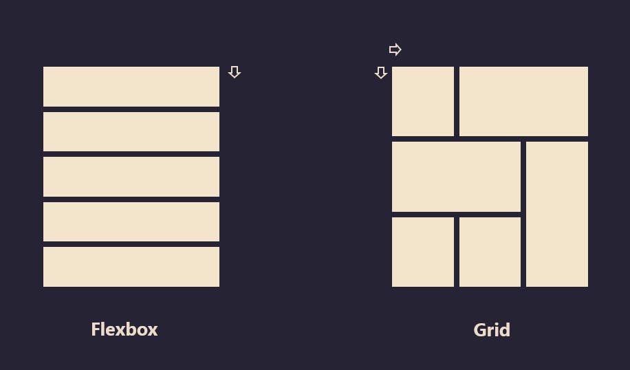
CSS grid is a layout system used for building two-dimensional layouts by using rows and columns. Grid can be used for building simple and complex layouts. An example of a complex layout is the Periodic Table
Properties for the Parent
display : grid
- To create a grid, we can simply do this by setting an element to:
display: gridordisplay: inline-gridThis automatically makes all the direct children of the element a grid item which is kind of similar to flexbox which has its direct children as flex items.
Defines the element as a grid container and establishes a new grid formatting context for its contents.
Values:
grid– generates a block-level gridinline-grid– generates an inline-level grid
grid-template-columns or rows
Defines the columns and rows of the grid with a space-separated list of values. The values represent the track size, and the space between them represents the grid line.
  .container {
    grid-template-columns: repeat(3, 20px [col-start]);
  }
Which is equivalent to this:
  .container {
    grid-template-columns: 20px [col-start] 20px [col-start] 20px [col-start];
  }
grid-template-areas
- Defines a grid template by referencing the names of the grid areas which are specified with the
grid-areaproperty. Repeating the name of a grid area causes the content to span those cells. A period signifies an empty cell. The syntax itself provides a visualization of the structure of the grid.
grid-template
- A shorthand for setting
grid-template-rows,grid-template-columns, andgrid-template-areasin a single declaration.
column-gap / row-gap / grid-column-gap / grid-row-gap
Specifies the size of the grid lines. You can think of it as setting the width of the gutters between the columns/rows.
  .container {
    grid-template-columns: 100px 50px 100px;
    grid-template-rows: 80px auto 80px;
    column-gap: 10px;
    row-gap: 15px;
  }
gap / grid-gap
A shorthand for
row-gapandcolumn-gap.container { grid-template-columns: 100px 50px 100px; grid-template-rows: 80px auto 80px; gap: 15px 10px; }If no
row-gapis specified, it’s set to the same value ascolumn-gap
justify-items
Aligns grid items along the inline (row) axis (as opposed to
align-itemswhich aligns along the block (column) axis). This value applies to all grid items inside the container.Values:
start– aligns items to be flush with the start edge of their cellend– aligns items to be flush with the end edge of their cellcenter– aligns items in the center of their cellstretch– fills the whole width of the cell (this is the default)
align-items
Aligns grid items along the block (column) axis (as opposed to
justify-itemswhich aligns along the inline (row) axis). This value applies to all grid items inside the container.Values:
stretch– fills the whole height of the cell (this is the default)start– aligns items to be flush with the start edge of their cellend– aligns items to be flush with the end edge of their cellcenter– aligns items in the center of their cellbaseline– align items along text baseline. There are modifiers tobaseline—first baselineandlast baselinewhich will use the baseline from the first or last line in the case of multi-line text.
place-items
place-itemssets both thealign-itemsandjustify-itemsproperties in a single declaration.Values:
<align-items>/<justify-items>– The first value setsalign-items, the second valuejustify-items. If the second value is omitted, the first value is assigned to both properties.
This can be very useful for super quick multi-directional centering:
  .center {
    display: grid;
    place-items: center;
  }
justify-content
Sometimes the total size of your grid might be less than the size of its grid container. This could happen if all of your grid items are sized with non-flexible units like
px. In this case you can set the alignment of the grid within the grid container. This property aligns the grid along the inline (row) axis (as opposed toalign-contentwhich aligns the grid along the block (column) axis).Values:
start– aligns the grid to be flush with the start edge of the grid containerend– aligns the grid to be flush with the end edge of the grid containercenter– aligns the grid in the center of the grid containerstretch– resizes the grid items to allow the grid to fill the full width of the grid containerspace-around– places an even amount of space between each grid item, with half-sized spaces on the far endsspace-between– places an even amount of space between each grid item, with no space at the far endsspace-evenly– places an even amount of space between each grid item, including the far ends
align-content
Sometimes the total size of your grid might be less than the size of its grid container. This could happen if all of your grid items are sized with non-flexible units like
px. In this case you can set the alignment of the grid within the grid container. This property aligns the grid along the block (column) axis (as opposed tojustify-contentwhich aligns the grid along the inline (row) axis).Values:
start– aligns the grid to be flush with the start edge of the grid containerend– aligns the grid to be flush with the end edge of the grid containercenter– aligns the grid in the center of the grid containerstretch– resizes the grid items to allow the grid to fill the full height of the grid containerspace-around– places an even amount of space between each grid item, with half-sized spaces on the far endsspace-between– places an even amount of space between each grid item, with no space at the far endsspace-evenly– places an even amount of space between each grid item, including the far ends
place-content
place-contentsets both thealign-contentandjustify-contentproperties in a single declaration.Values:
<align-content>/<justify-content>– The first value setsalign-content, the second valuejustify-content. If the second value is omitted, the first value is assigned to both properties.
All major browsers except Edge support the
place-contentshorthand property.
grid-auto-columns / grid-auto-rows
- Specifies the size of any auto-generated grid tracks (aka implicit grid tracks). Implicit tracks get created when there are more grid items than cells in the grid or when a grid item is placed outside of the explicit grid.
grid-auto-flow
If you have grid items that you don’t explicitly place on the grid, the auto-placement algorithm kicks in to automatically place the items. This property controls how the auto-placement algorithm works.
Values:
row– tells the auto-placement algorithm to fill in each row in turn, adding new rows as necessary (default)column– tells the auto-placement algorithm to fill in each column in turn, adding new columns as necessarydense– tells the auto-placement algorithm to attempt to fill in holes earlier in the grid if smaller items come up later
grid
A shorthand for setting all of the following properties in a single declaration:
grid-template-rows,grid-template-columns,grid-template-areas,grid-auto-rows,grid-auto-columns, andgrid-auto-flow(Note: You can only specify the explicit or the implicit grid properties in a single grid declaration)..container { grid: 100px 300px / auto-flow 200px; } .container { grid-template-rows: 100px 300px; grid-auto-flow: column; grid-auto-columns: 200px; } // .container { grid: auto-flow dense 100px / 1fr 2fr; } .container { grid-auto-flow: row dense; grid-auto-rows: 100px; grid-template-columns: 1fr 2fr; } // .container { grid: auto-flow / 200px 1fr; } .container { grid-auto-flow: row; grid-template-columns: 200px 1fr; } // .container { grid: 100px 300px / 3fr 1fr; } .container { grid-template-rows: 100px 300px; grid-template-columns: 3fr 1fr; }
Properties for the Children
grid-column-start / grid-column-end / grid-row-start / grid-row-end
Determines a grid item’s location within the grid by referring to specific grid lines.
grid-column-start/grid-row-startis the line where the item begins, andgrid-column-end/grid-row-endis the line where the item ends..item-a { grid-column-start: 2; grid-column-end: five; grid-row-start: row1-start; grid-row-end: 3; }
grid-column / grid-row
Shorthand for grid-column-start + grid-column-end, and grid-row-start + grid-row-end, respectively.
Values:
<start-line>/<end-line>each one accepts all the same values as the longhand version, including span
grid-area
Gives an item a name so that it can be referenced by a template created with the
grid-template-areasproperty. Alternatively, this property can be used as an even shorter shorthand forgrid-row-start+grid-column-start+grid-row-end+grid-column-end.Values:
<name>– a name of your choosing<row-start>/<column-start>/<row-end>/<column-end>– can be numbers or named lines
justify-self
Aligns a grid item inside a cell along the inline (row) axis (as opposed to
align-selfwhich aligns along the block (column) axis). This value applies to a grid item inside a single cell.Values:
start– aligns the grid item to be flush with the start edge of the cellend– aligns the grid item to be flush with the end edge of the cellcenter– aligns the grid item in the center of the cellstretch– fills the whole width of the cell (this is the default)
align-self
Aligns a grid item inside a cell along the block (column) axis (as opposed to
justify-selfwhich aligns along the inline (row) axis). This value applies to the content inside a single grid item.Values:
start– aligns the grid item to be flush with the start edge of the cellend– aligns the grid item to be flush with the end edge of the cellcenter– aligns the grid item in the center of the cellstretch– fills the whole height of the cell (this is the default)
place-self
place-selfsets both thealign-selfandjustify-selfproperties in a single declaration.Values:
auto– The “default” alignment for the layout mode.<align-self>/<justify-self>– The first value setsalign-self, the second valuejustify-self. If the second value is omitted, the first value is assigned to both properties.
Special Units & Functions
You’ll likely end up using a lot of fractional units in CSS Grid, like
1fr. They essentially mean “portion of the remaining space”. So a declaration like:grid-template-columns: 1fr 3fr;Means, loosely,
25% 75%. Except that those percentage values are much more firm than fractional units are. For example, if you added padding to those percentage-based columns, now you’ve broken 100% width (assuming acontent-boxbox model). Fractional units also much more friendly in combination with other units, as you can imagine:grid-template-columns: 50px min-content 1fr;
Sizing Keywords
When sizing rows and columns, you can use all the lengths you are used to, like
px, rem, %, etc, but you also have keywords:min-content: the minimum size of the content. Imagine a line of text like “E pluribus unum”, the min-content is likely the width of the word “pluribus”.max-content: the maximum size of the content. Imagine the sentence above, themax-contentis the length of the whole sentence.auto: this keyword is a lot likefrunits, except that they “lose” the fight in sizing againstfrunits when allocating the remaining space.fit-content: use the space available, but never less than min-content and never more thanmax-content.fractional units: see above
Sizing Functions
The
minmax()function does exactly what it seems like: it sets a minimum and maximum value for what the length is able to be. This is useful for in combination with relative units. Like you may want a column to be only able to shrink so far. This is extremely useful and probably what you want:grid-template-columns: minmax(100px, 1fr) 3fr;The
min()function.The
max()function.
The repeat() Function and Keywords
The
repeat()function can save some typing:grid-template-columns: 1fr 1fr 1fr 1fr 1fr 1fr 1fr 1fr; /* easier: */ grid-template-columns: repeat(8, 1fr); /* especially when: */ grid-template-columns: repeat(8, minmax(10px, 1fr));But
repeat()can get extra fancy when combined with keywords:auto-fill: Fit as many possible columns as possible on a row, even if they are empty.auto-fit:Fit whatever columns there are into the space. Prefer expanding columns to fill space rather than empty columns.
This bears the most famous snippet in all of CSS Grid and one of the all-time great CSS tricks:
    grid-template-columns:
      repeat(auto-fit, minmax(250px, 1fr));
Reference
Thank You for reading!