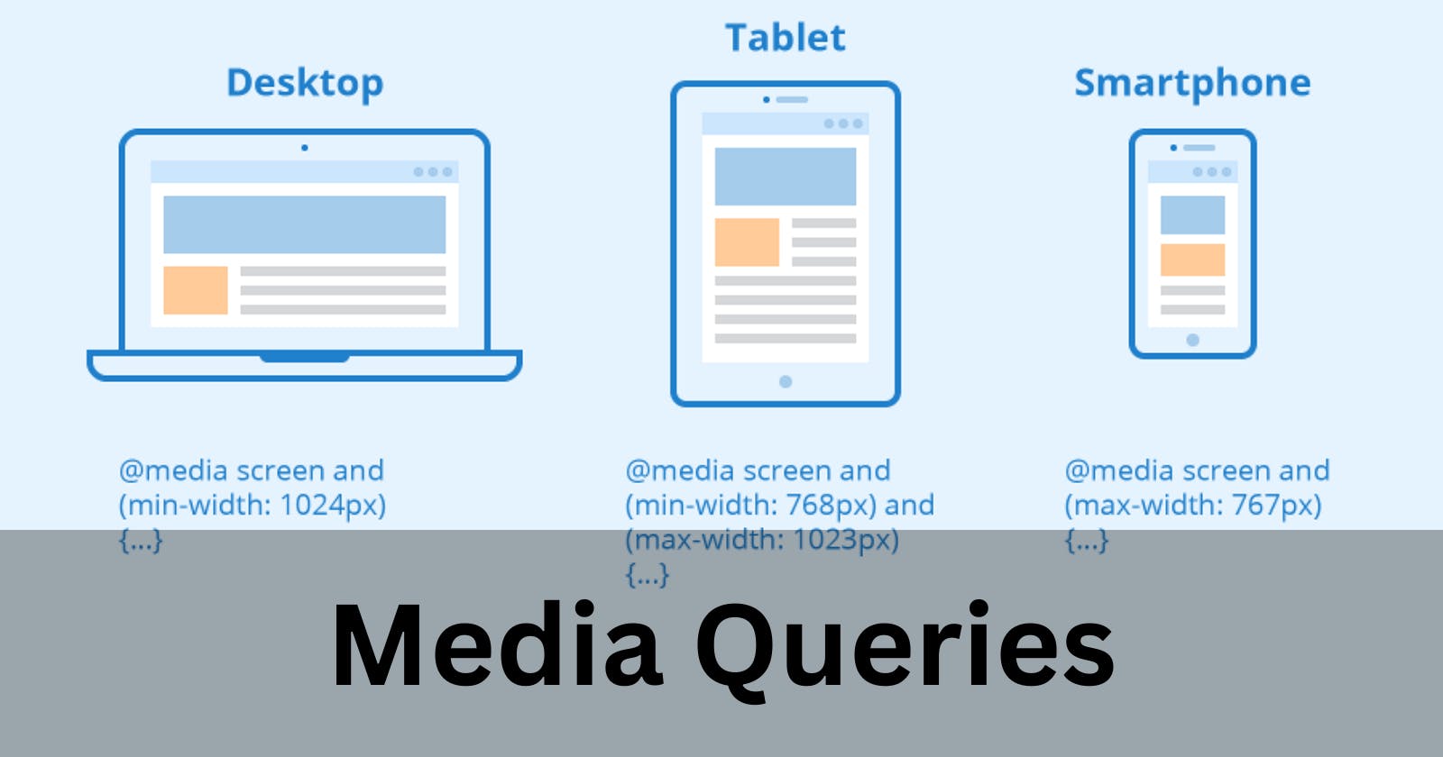


Media queries allow you to apply CSS styles depending on a device's general type (such as print vs. screen) or other characteristics such as screen resolution or browser viewport width.
If the browser window is 600px or smaller, the background color will be light blue:
Always Design for Mobile First
Mobile First means designing for mobile before designing for desktop or any other device (This will make the page display faster on smaller devices).
This means that we must make some changes in our CSS.
Orientation: Portrait / Landscape
Media queries can also be used to change layout of a page depending on the orientation of the browser.
You can have a set of CSS properties that will only apply when the browser window is wider than its height, a so called "Landscape" orientation:
Hide Elements With Media Queries
Another common use of media queries, is to hide elements on different screen sizes:
Change Font Size With Media Queries
You can also use media queries to change the font size of an element on different screen sizes: